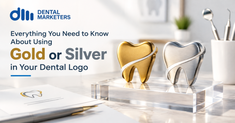
Gold and silver are metallic colours that add a sense of luxury and trust to a dental logo. However, they behave differently on screens and in print, so practices should choose flat gold, gradient gold, or foil gold based on where the logo will appear.
Gold and silver can make a dental logo feel special. But these colours are not simple to use. They look different on a screen than they do on paper. This guide explains what gold and silver mean in branding. It also shows how to use them well in your dental practice.
What Are Gold and Silver in Branding?
Gold and silver are metallic colours. In branding, they often stand for quality, trust, and care. Many top brands use them to look premium. However, a normal screen cannot show real metallic shine. So, designers use clever tricks to copy the look of real metal. As a result, your logo can still feel rich and warm, even on a phone screen.
How Gold and Silver Work in Logo Design
First, it helps to know that gold and silver are not like normal colours. Standard colours use RGB on a screen. They use CMYK ink in print. But metallic colours need extra shine to look real. Therefore, they behave differently depending on where you use them.
Here are the key facts to know:
- On a screen, gold and silver usually look flat. They cannot truly shine like real metal.
- In print, you can use gold foil for a real metallic effect. This process presses a thin layer of gold onto the paper.
- Foil printing costs more than standard printing. For example, gold foil business cards can cost several times more than plain ones.
- A strong logo with gold or silver must still work as a flat colour. This matters because most screens cannot show true metallics.
- So, your designer should test the logo in both a flat version and a shiny version before you approve it.
- Also, gold and silver pair well with simple shapes. Busy or detailed logos often lose the shine effect.
Because of this, many dental practices choose a middle path. They use a warm, rich gold tone for the website and social media. Then, they upgrade to real gold foil for special print items, such as premium business cards or gift vouchers.
Also read: https://dentalmarketers.co.uk/competitive-dental-practices-marketing-success/
Types of Gold You Can Use
Flat Gold
This is a solid gold colour. It works well on screens and in standard print. It is the most flexible option for everyday use, such as your website, app icon, and social media pages.
Gradient Gold
This blends light and dark gold tones together. It gives a soft sense of shine without needing special print methods. Many dental brands use this style for a balance of warmth and elegance.
Foil Gold
This uses a special print process with real metal foil. It looks stunning on business cards, invitations, and premium packaging. However, it only works in print. You cannot use true foil gold on a screen.
Step-by-Step Guide to Choosing Gold or Silver for Your Logo
Step 1: Decide where you will use your logo most. Think about your website, social media, signage, uniforms, and print materials.
Step 2: Pick a metallic style that fits your needs. Flat gold suits screens best. Gradient gold works well for both screen and print. Foil gold is only for print, but it looks the most luxurious.
Step 3: Test your logo in plain black and white first. A strong logo should still look clear without any colour. This step proves that the shape and design work on their own.
Step 4: Check your logo at a small size. Make sure it stays sharp on a favicon, an app icon, or a small badge on social media.
Step 5: Ask your designer for a print proof. This shows exactly how gold or silver will look on business cards, signage, and letterheads before you commit to a full print run.
Step 6: Set a clear budget for print. Foil printing costs more, so plan ahead if you want this finish on premium materials.
Step 7: Pair your metallic colour with a strong base colour. Black, deep green, or navy blue often work well next to gold or silver. This keeps the design balanced and easy to read.
Benefits and Key Points to Remember
- Gold and silver quickly suggest quality and trust to new patients.
- A well-designed metallic logo still works as a flat colour when it needs to.
- Foil printing adds a premium feel to items patients keep, such as business cards.
- Simple shapes work best with metallic colours. Complex designs often lose the shine effect on screens.
- Your logo should always look strong in plain black and white, with no colour at all.
- A metallic logo is not only about looking rich. It should also reflect your practice’s values, such as care, comfort, and trust.
- Pairing gold or silver with a calm base colour helps your brand stay timeless, rather than dated.
- Consistency matters. Use the same shade of gold or silver across your website, signage, and print materials.
Common Mistakes to Avoid
Many practices make small mistakes with gold and silver logos. Here is what to watch for:
- Using true foil gold on a website. It will not display the way you expect, so it can look dull or flat instead of shiny.
- Making the logo too detailed. Fine lines and small shapes often blur when a metallic colour is added.
- Skipping the black-and-white test. If your logo only works in gold, it is likely too weak on its own.
- Using different shades of gold across your website, signage, and print materials. This makes your brand look inconsistent.
- Choosing gold or silver just because it looks luxurious, without thinking about your patients. Your colour choice should match your practice’s personality, not just trends.
Avoiding these mistakes early can save you time and money later. In short, a little planning goes a long way.
Frequently Asked Questions
Does gold in a logo make my practice look too expensive?
Not always. Many patients link gold with quality care rather than high prices. Still, pair it with warm, friendly messaging so your brand feels welcoming to everyone.
Can I use real metallic gold on my website?
No, not fully. Screens cannot show true metallic shine. Designers use flat gold or gradient gold instead, which gives a similar warm feeling.
What is the difference between flat gold and foil gold?
Flat gold is a solid colour. It works well on screens and in standard print. Foil gold uses a special print process, so it only works on paper, not on screens.
Is foil printing expensive?
Yes, foil printing costs more than standard printing. However, it can work well for smaller print runs, such as premium business cards or invitations.
Will a gold or silver logo go out of style?
It can, if the design is too busy or trend-led. A simple, well-balanced logo with metallic tones tends to last much longer.
Should every dental practice use gold or silver?
No. It depends on your brand style and the patients you want to attract. Some practices suit bright, friendly colours better than metallic tones.
How do I make sure my gold logo prints correctly every time?
Ask your printer for a Pantone metallic reference number. This keeps the colour consistent across all your printed materials, from letterheads to signage.
Ready to Build a Logo Your Patients Will Trust?
A great dental logo does more than look nice. It builds trust before a patient even steps through your door. If you want a logo that uses gold, silver, or any colour in the right way, Dental Marketers can help. Our team designs clear, timeless dental brands built to last for years, not months. We understand how colour, shape, and print all work together to build patient trust.
Get in touch with Dental Marketers today to start your branding journey.
Also read: Why an Unoriginal Dental Logo is Bad for Your Practice?